Case study
UBA — Mobile Maritime Booking
Designing the Union des Bateliers Arcachonnais's first mobile application to digitize excursion booking and QR ticket access on the Arcachon Bay.

Context
The Union des Bateliers Arcachonnais is a maritime company founded in 1954 that operates 35 boats and serves the Arcachon Bay from seven embarkation points. Its website generates over a million visits a year but has historically remained non-transactional for fixed-schedule excursions. I joined the project as a Product Designer, working alongside a second designer and a project lead, with a clear mission: to design the company’s first iOS mobile application.
Problem
In 2023, UBA ticketing rested on two channels: a website and a network of physical desks near the embarkation points. Online booking did exist, but the funnel was tedious, many steps, an interface ill-suited to mobile, reliance on a strong connection, and many users abandoned along the way. A tourist discovering a cruise to Bird Island from their phone would fall back on the desk: they had to travel there, wait in line, and hope for a seat. On the operations side, every departure meant a queue, a paper check, and a manual re-entry. One million web visits a year, with no dedicated mobile app to capture them, summed up the gap to close: capturing demand where it originates, all the way through to the ticket scanned at the embarkation kiosk.
Challenge 01 — Mapping the bay visitor’s journey
The challenge: understanding how a tourist decides to step aboard (on which device, at which moment, with which information) before drawing a single screen.
My approach: at the project’s kick-off, we ran interviews with recent travellers and UBA desk agents. Two usage patterns emerged sharply: planned booking (the evening before, from a hotel) and impulse decisions (on the pier, ten minutes before departure). These scenarios imposed opposing constraints: one accepts detailed reading, the other demands a decision in three taps. Low-fidelity wireframes were the tool that let us arbitrate this tension without getting lost in visual detail.
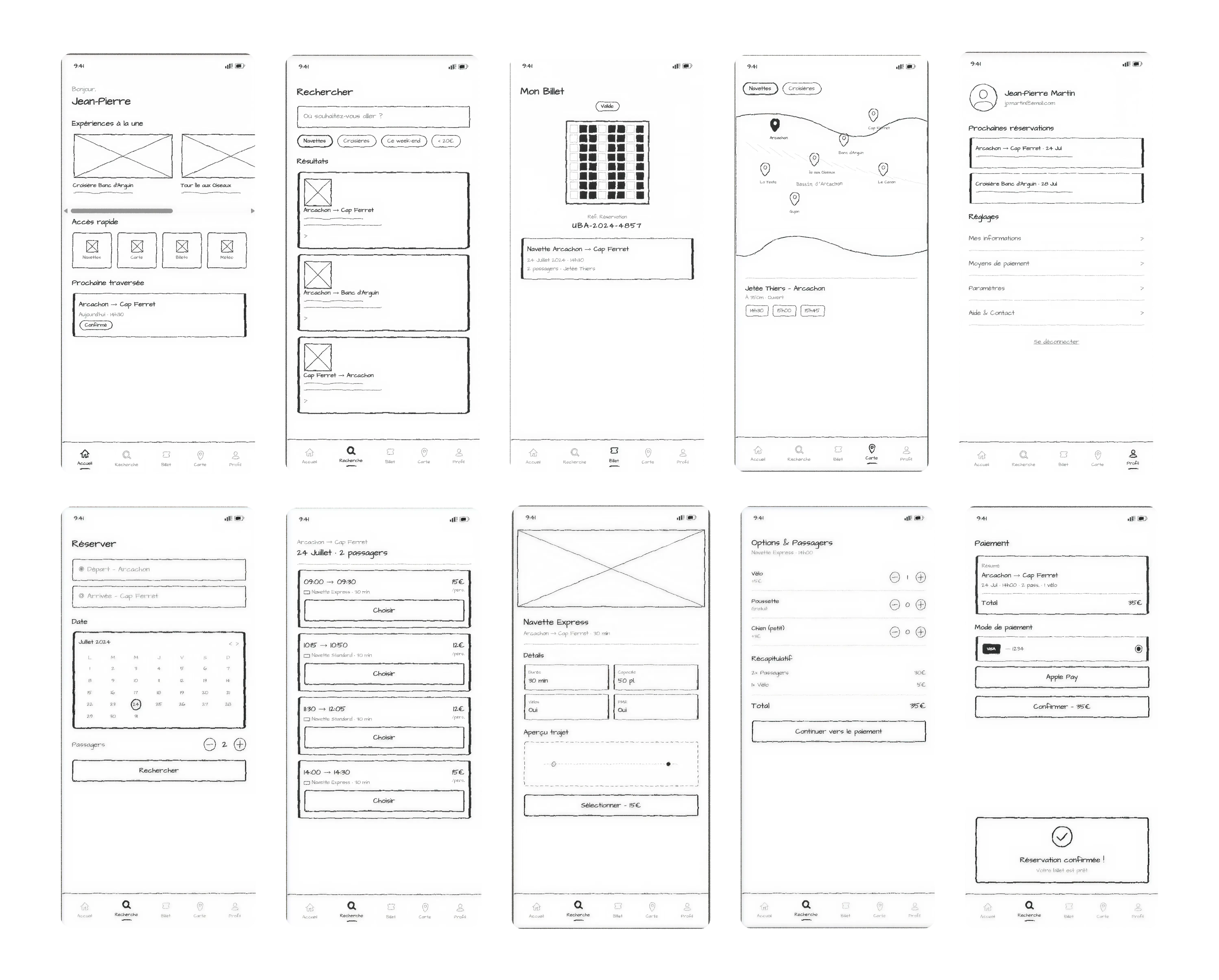
Challenge 02 — Stabilising a five-entry iOS tab bar
The challenge: giving the two critical flows a permanent entry point without overloading navigation.
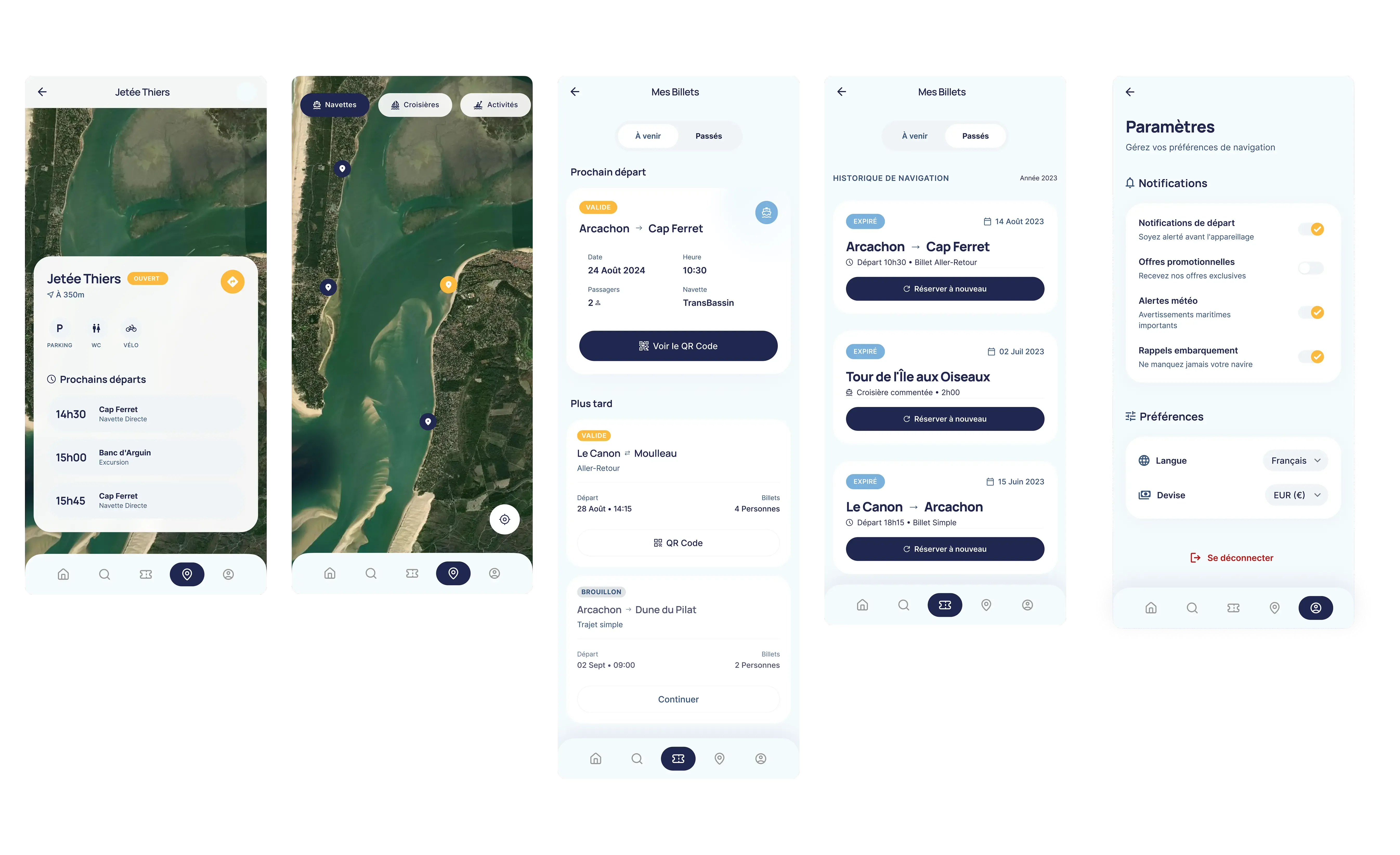
My approach: I arbitrated the information architecture on five tabs: Home, Search, Ticket, Map, Account. Ticket is the non-negotiable one: a user who has booked must reach their QR from anywhere in the app, in a single tap. Map materialises the seven embarkation points on the Bay, a direct response to the orientation need surfaced in interviews. Search and Account were kept as standalone entries rather than buried in a menu, to honour native iOS heuristics.
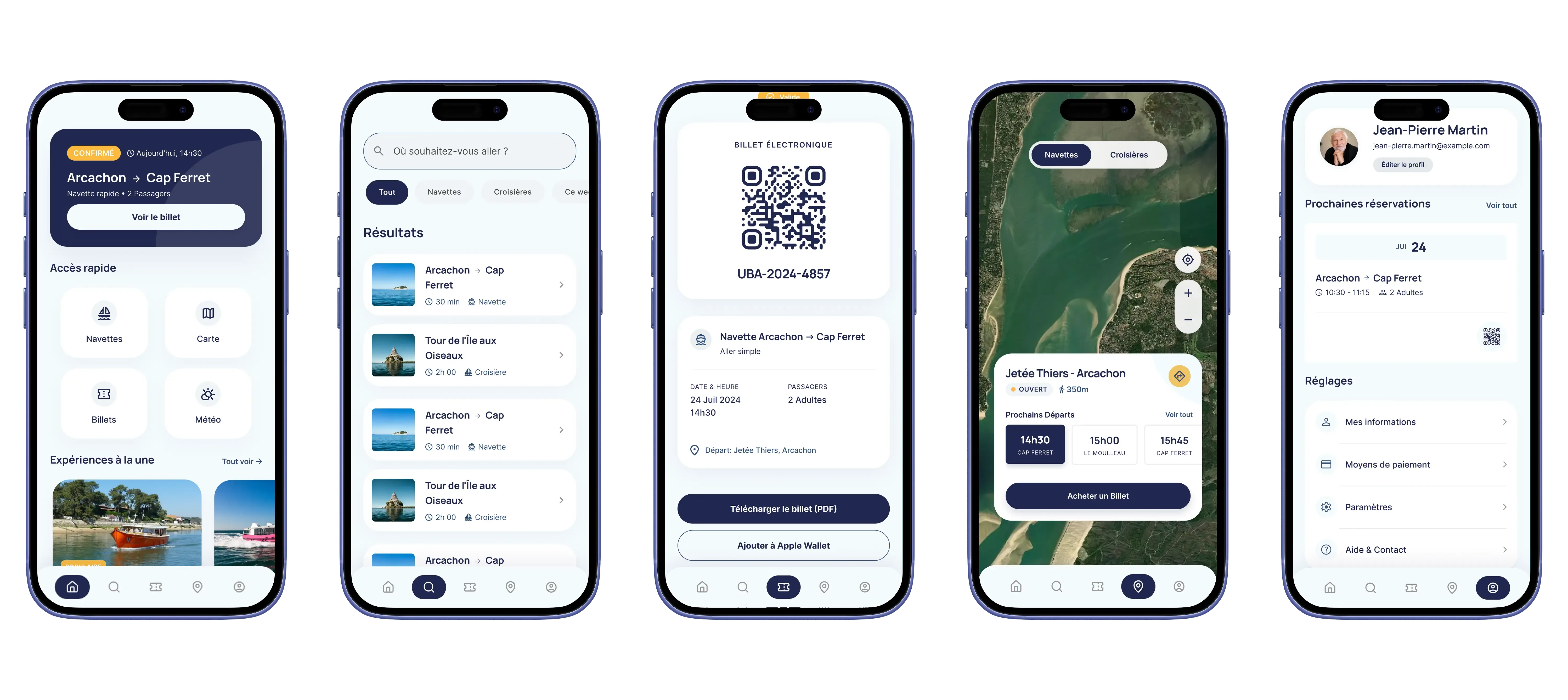
Challenge 03 — Shipping a QR ticket that scans without friction
The challenge: a ticket that fails to load at boarding means a lost booking and a customer redirected to the desk. The tolerance for error is zero.
My approach: I treated the Ticket screen as a standalone component, designed around a single constraint: being readable by a kiosk scanner in a few seconds, on a phone with variable brightness. The QR is centred, at maximum contrast, with no decorative elements around it. Trip metadata (time, dock, passenger count) is pushed below the code. Ticket access remains available offline once the booking is confirmed, a non-negotiable constraint on a coastal area with uneven coverage.
Iterations and design decisions
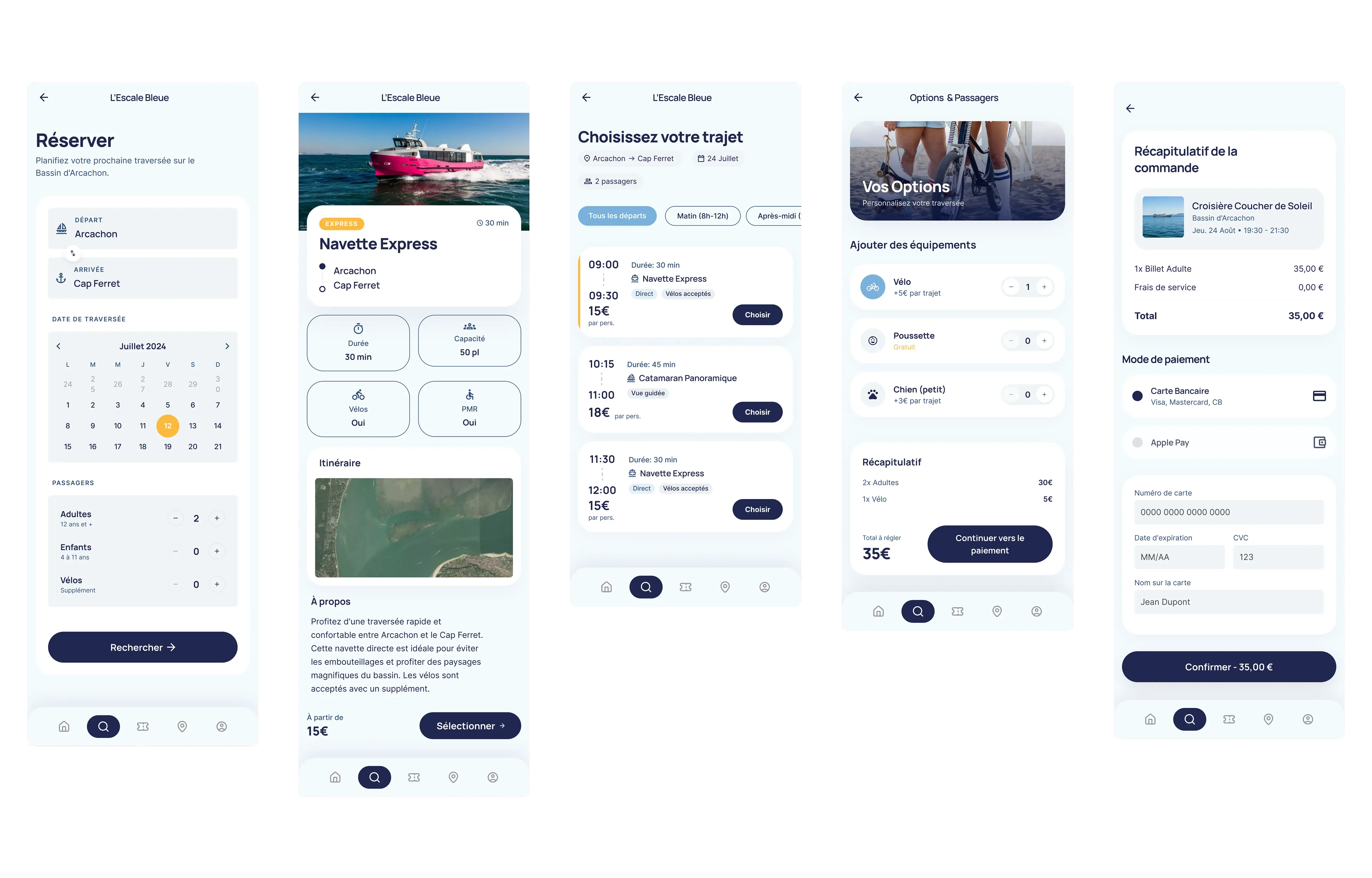
V1 placed the Ticket tab under Account, logical from an architecture standpoint (a ticket belongs to an account), but costly in use: two extra taps under the pressure of boarding. V2 promoted it to a root tab. On the payment tunnel, I tested in V0 a compacted version merging time-slot picking and passenger entry on a single screen; feedback flagged a loss of clarity on the booking state (“have I paid yet?”). The final version splits those steps again to preserve status clarity, a deliberate reversal after testing.
Results and impact
- 2 critical flows shipped as high-fidelity mockups: full booking and QR ticket access.
- Five-entry iOS tab bar stabilised and validated through internal UX review.
- 7 embarkation points integrated into the app’s interactive map.
Reflection
The payment tunnel was, by far, the most complex challenge on the project. Designing four screens that hold together (slot, passengers, payment, confirmation) while keeping the booking state legible at each step, was less a screen problem than a grammar problem. I underestimated, at first, the cognitive load of a mobile transactional tunnel: every hierarchy decision on a single screen has a cascading effect on the trust the user feels about the payment.
What was hard: keeping coherence between the in-progress, validated and failed states without multiplying screens. The temptation is to add variants; the discipline is to compress them without losing legibility. More broadly, a mobile payment tunnel concentrates on its own every product constraint (technical gateway, legal obligations, native keyboard, input errors) and each one must be reconciled into a single flow.
What I would do differently today: stress-test the tunnel on real users from V0 onwards: not in a lab, but on the pier, ten minutes before a departure. Decisions made in a quiet room from a Figma prototype don’t always survive the reality of a packed summer day on the Bay. The iOS heuristics gave me a frame; fieldwork would have given me the right trade-offs sooner.